 A Very Happy and Prosperous New Year To All!
 Wishing you health and happiness in 2011 and fun with letterpress printing too. We're looking forward to producing your amazing design in the coming year.
 A Very Happy and Prosperous New Year To All!
  A grapevine winds its way around this invitation and tiny insects crawl over the soft, soft, soft Somerset Velvet 300gsm, letterpress printed in burgundy ink. Enclosed in its fat, lined envelope, this is just what anyone would love to hear drop through the letterbox on a dark December morning.
 "Season's Greetings!" (get it) from Visual Vanilla, white foil on Colorplan 350gsm bright red.
 Santa Claus stopped by this morning and him and auld Dan discussed where best to invest their fortunes in 2011 before Santa set off on his annual round the world trip.
Hope Santa's good to you all - maybe you'll get a John Bull printing set in your stocking. Have a great holiday and see you next post. 
 The Glasgow Improvisers Orchestra's annual festival of free improvisation and collaboration is celebrated at the CCA Glasgow this weekend.
 Printed on both sides of Colorplan 540gsm pristine white, inks were overlaid to excellent effect, with crisp impressions and vibrant colour.
 We litho printed the accompanying A4 posters on Colorplan 12ogsm.
 Fabulous design that echoes the energy and excitement of musical improvisation.
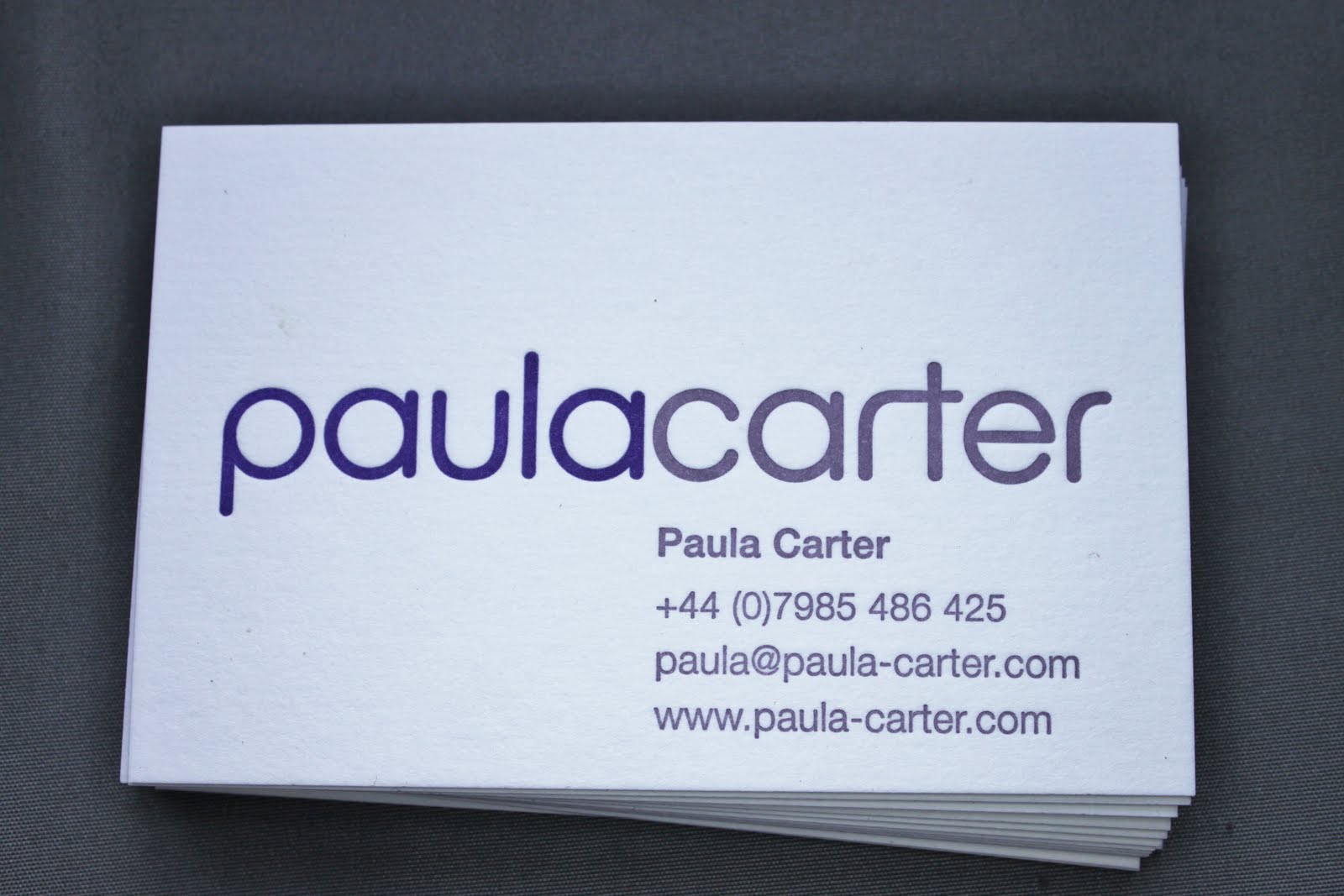 Mixing ink to match colour of board is a simple but highly effective way of creating a business card which makes impact on sight of face and again when turned to reverse.
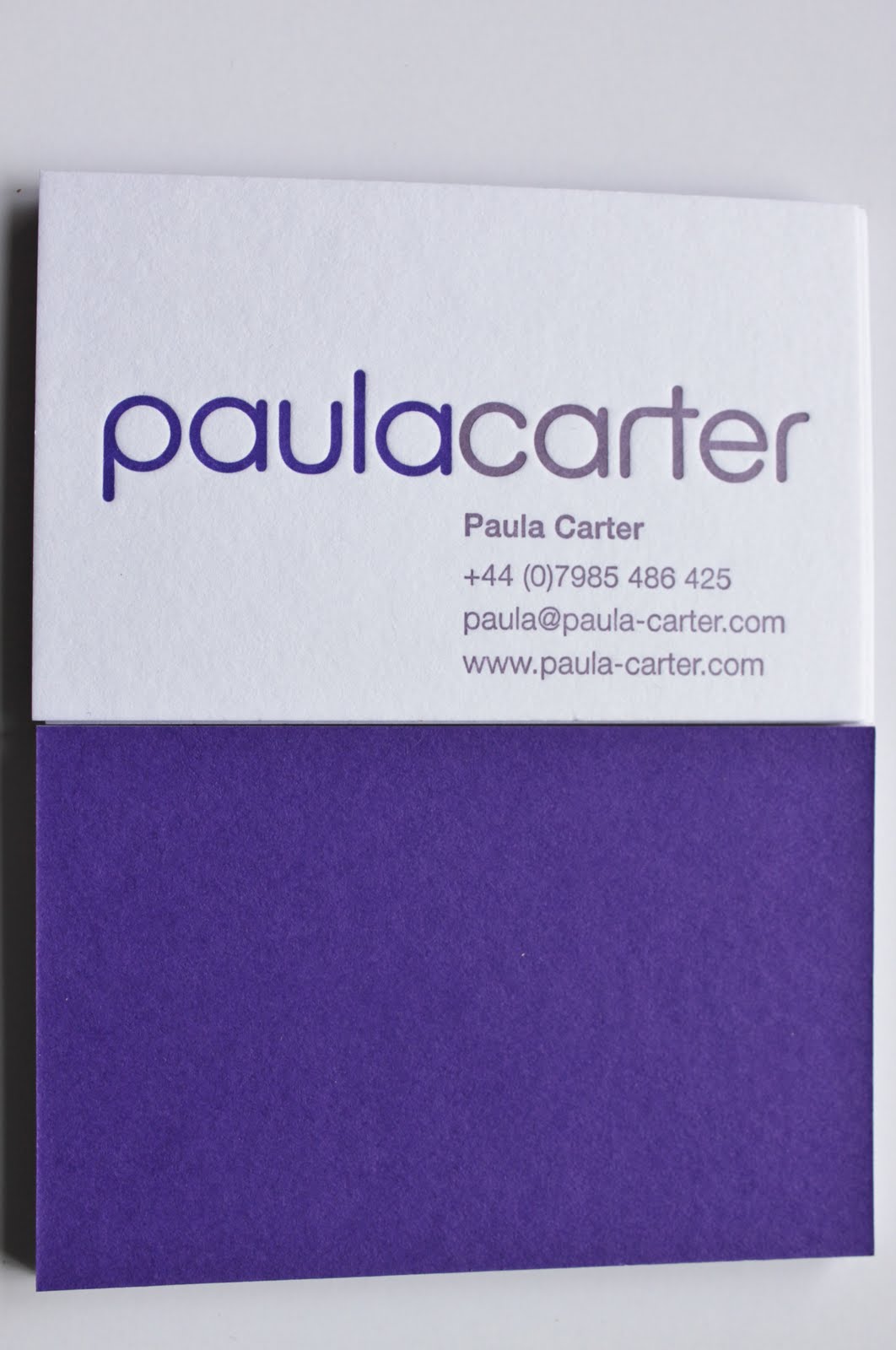 Paula Carter chose Colorplan Duplex 540gsm, bright white to purple, and we letterpress printed to the white side in two inks, one matching the purple and the other a few tints lighter.
 The result is a business card of regal quality that commands attention and will be retained for future consultation.
 Edinburgh restaurant The Ship On The Shore offers the finest ingredients, passionately prepared and finely presented. Graphic designer Ramsay Macfarlane sought to represent this high level of quality in the latest of his projects for the seafood restaurant; a voucher cheque in a presentation wallet.
 Imperial Blue Colorplan 350gsm with a pebble emboss from GF Smith gives an imposing weight to the wallet. The nautical logo is foiled in regal gold. Two semi-circular slits are diecut in the underside to hold the voucher in place.