Monday 28 October 2013

Ex-Libris


Bookplates, also known as ex-libris, are pasted into books to declare ownership and date back to the fifteenth century. Interest in these beautiful examples of art and print comes from bibliophiles, artists and designers, genealogists, collectors and, of course, printers. You can find out more from The Bookplate Society

We printed this bookplate for our client  in Portugal who sent us his personal design and requested letterpress printed black ink onto Zerkall 145gsm  

Friday 4 October 2013

The Glasgow Guild


The Glasgow Guild opens from 5th October 2013. They offer a furniture restoration, upholstery and polishing service and sell quality furniture and furnishings. Using the best traditional techniques and finest materials, they create furniture that is beautiful and built to last. 

We were pleased to work with designer Jen Davies to create an invitation for the grand opening of the company. Jen tells us a bit about herself and her thinking behind the design. 

"I live a few doors down from where John and Jonathan are converting an old tenement corner shop into The Glasgow Guild - a space to showcase and sell the incredible bits of furniture that they restore. We got talking, I followed them on twitter, they clicked through to my website, saw some of the Glasgow skyline illustrations I created for Glasgow Film Festival a few years ago and asked me to design the invitations for their launch.

This sounded like fun. They wanted something based on Garnethill where the shop is based but said I could do whatever I wanted. After doodling bits of the neighbourhood it started to feel a bit much for an A6 invitation so I simplified things, and sketched what they told me the shop would look like. It all came together pretty quickly - some fairly loose ink painting, a woman and a dog to give it a bit of life and then some text and the areas to be gilded added in Illustrator. Then sent it to you for you to work your magic…!

A bit about me - I'm a designer, film marketer, doodler, jack-of-all-creative-trades based in Glasgow. I currently work for Park Circus Films creating film posters, overseeing trailers and promoting classic films as they're put back into cinemas around the world" . http://www.jendavies.co.uk/

The invitation is letterpress printed in black ink with monogram and a sheen of gold foil on substantial Beermat board.

Friday 27 September 2013

Paper Logs; Fire Up the Recycling

As printers, we have a lot of waste paper. Bins stand by our guillotine, full of offcuts and trimmings.
We donate the larger sheets and dinky little squares of card to our local primary schools where they are transformed into everything from flash cards to Christmas decorations.
Trimmings and useless shaped stuff goes to a paper recycling centre.
However, Old Dan, whose motto is "use it up, wear it out, make do or do without", came up with a plan to keep us cosy this coming winter.
Now our Colorplan offcuts are soaking in a big bin of water till they are suitably soggy - kind of stinky actually, so we keep the lid firmly shut.
 We purchased a paper compressor and use it to form paper bricks in the mould.
 We stack them to dry - which was wonderful during the sunny Scottish summer we just enjoyed.
And we are storing them to burn in roaring wintertime fires. Look out for a invitation to share in our papery bonfire at the new year!

Tuesday 24 September 2013

Tobyboo

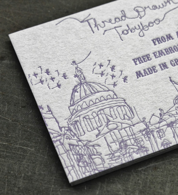
Creator of Tobyboo, Tina Crawford's illustrations are completely free machine embroidered, with no markings or drawing beforehand. Every one is completely unique and can’t be repeated, drawn with the needle just as you would a pencil. The fluidity of threads is captured onto tableware, cushions, stationery and textiles, and every part of Tobyboo manufacturing is 100% done in Great Britain. 

Tobyboo's business cards feature Tina's delightful illustrations, letterpress printed in lilac ink on Colorplan 540gsm of Pale Grey.

Friday 20 September 2013

Love Hate Tattoo

Amazing business card for tattoo artist and crazy cat lady, Flo Nuttall at LoveHateTattoo.
It was a joy to work with talented designer, Chris Baldie of Papertank who created this startling mediaeval image of martyrdom which we foiled in gloss black with lettering in gold on Colorplan Dark Grey 540gsm.
This is a business card to keep in your wallet and peer at from time to time in wonder.

Wednesday 18 September 2013

G2G3


When G2G3, a global serious games organisation based in Edinburgh, underwent a rebranding exercise, they designed new business cards, leveraging a rainbow of colours from their revised palette The focus is on quality and texture. The resulting cards are dramatic and eye-catching, using foil to bring the company logo to life.
Each name has a range of cards across 5 colourways from the Colorplan range, by GF Smith.
A gloss black foil is applied to the Ebony side of the cards.
White foil is applied to the colour face with contact details, and a clear foil highlights the company logo.

Friday 28 June 2013

Search: A Heart-felt Congratulations


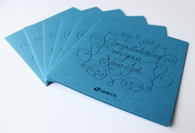
Search Consultancy: Card, 4pp fly, folded to 148x148mm, Colorplan 350gsm Adriatic, Hotfoil metallic dark blue

With 14 offices throughout Britain, an easy to use website, and over 2700 current listings, when seeking employment Search Consultancy is the place to go. Whether it's your first job, next job or best job, Search can help find the right one for you. As if helping you find work won't leave you pleased enough, Search have teamed up with Glasgow Press to create this bespoke card to congratulate candidates on their new job. It's a well done to them on a well done to you!


Metallic dark blue foil onto Colorplan 350gsm Adriatic created this unique card, emblematic of the high-quality and special service that is a hallmark of the Search experience. Receiving one of these in the post would for sure make that new-job feeling all the sweeter.


Wednesday 19 June 2013

Avanti Schools Trust

In need of information, advice, or help in setting up a Free school, or converting to an Academy? With expertise in, vision and strategy development, Governor training, policy development, and much more, Avanti Schools Trust may be just the place for you. In-house brand manager Matthew Whitlock's love of duplexed Colorplan, metallic foiling and letterpress printing made Glasgow Press a natural choice for the printing of a stylish new business card.
,
For help with education
Avanti ease your stress.
To make the right impression,
The best is Glasgow Press.


Wednesday 12 June 2013

Thomas Wightman: Graphic Designer


Thomas Wightman, Cranes Lettra Fluorescent White 600gsm, front: black ink, heavy impression; back: blind debossed


Graduating this month from Edinburgh Napier University, graphic designer Thomas Wightman has already gained international experience and received industry recognition. Working with him to create a simple and tactile identity reflecting his current interests and graphic style was a pleasure. As he embarks on the next stage of his career, we say with our Japanese friends, ganbatte!


Napier's fellow dubbed Thomas
Made good on our best printer's promise,
When your job needs done right
And you're seeking delight
We're Glasgow Press, we are autochthonous


Thursday 6 June 2013

Traditional Characters with a Twist


James McNaught, black ink onto Colorplan Triplex 810gsm (three sheets of 270gsm board, bonded together) of White Frost / Ebony / White Frost. 


A graphic designer is James McNaught 
As a student at uni, he's learned quite a lot.
His business cards were printed by us
Colorplan Triplex was his stuff.


                  Black ink, White Frost, front and back
A wordsearch puzzle for you to attack.
If you think his work is up to scratch,
With your job he might just match.


When it's business cards you're after, we're right here
We'll do a cracking job, we'll get you in gear.


James, a self-described traditional character with a twist, sought to create a personal identity that expresses his interests (typography, print and considered design), without detracting viewers from what's important: the work. Here at Glasgow Press we think he's done a smashing job, and we were happy to help him achieve that ambition.

We like James's philosophy. When the work is important to you, we'll ensure the finish is exquisite.


Monday 13 May 2013

Phoneme/Grapheme

Manchester Phoneme/Grapheme Correspondence, a design project by Felix Mooneeram, was awarded a Commendation by ISTD.
This very interesting study depicts a phoneme, or spoken sound, through a character, or symbol, known as a grapheme.
A set of letterpress printed cards contained within a neat wallet enclosure explores the vowel sounds, as spoken in the Manchester regional accent.
The A5 cards are on a Dutch Greyboard 1200micron and letterpress printed in black ink with a coppery overprint.
The wallet is a finer Dutch Greyboard at 750micron weight, letterpress printed in black and diecut, using a die which we hold in stock.
Excellent design and a fascinating study too. Would love to see a Glesga version!

Tuesday 9 April 2013

Donostia

Donostia is a Basque Tapas Restaurant in Central London. Inspired by the town of Donostia in Northern Spain, you can enjoy wonderful gourmet food in a delightful setting. Donostia staff kindly tell us they chose Glasgow Press to print their fine business cards, so the quality would match the high standards of food and drink they offer.
This is an interesting combination of letterpress print and hotfoiling on tasty GF Smith Colorplan. The stock chosen is a duplex 540gsm of Ebony and Bright White. A buckram emboss is applied to the bright white side to add a fine texture. The cards are a mixture of print processes and include: white foil of restaurant logo and contact details to the ebony side and letterpress printed black ink of restaurant logo and address details to the white sides. A third permutation sees gold foil applied to both ebony and bright white sides of both logo and contacts. Very pleasing combinations which we were more than happy to accommodate.

Wednesday 3 April 2013

Artist Tour Management

We printed a business card for Neil Anderson who is the long standing tour manager for Biffy Clyro.
The card is Colorplan 540gsm; a duplex of Ice White and Dark Grey. The card was letterpress printed black ink to both sides, and as a print and tumble, this means the text and logo is half on one colour and half on the other.
Biffy fans will recognise the branches as a detail from the recently released album, "Opposites".